Solar Radiation and Solar Smart Window Dashboard

About the project
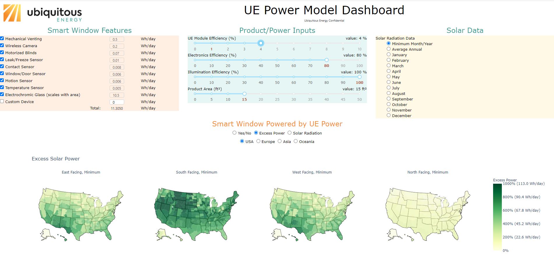
Plotly-Dash Dashboard for displaying solar radiation data and calculations about powering smart window features with solar windows at various locations in the world.
Built with:
Python
Project details:
I created this web-hosted interactive dashboard as a business development tool for my company. Full access to the tool is currently restricted to business partners only, which is why I have not shared the link.
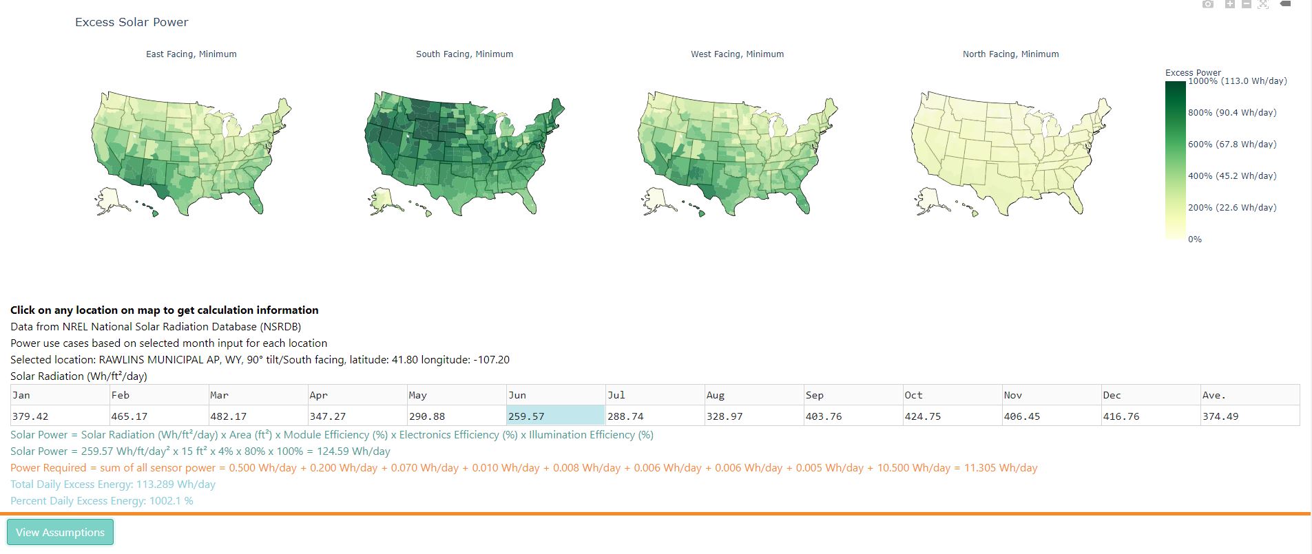
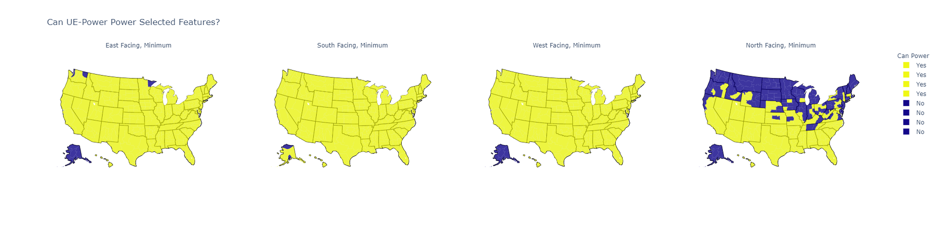
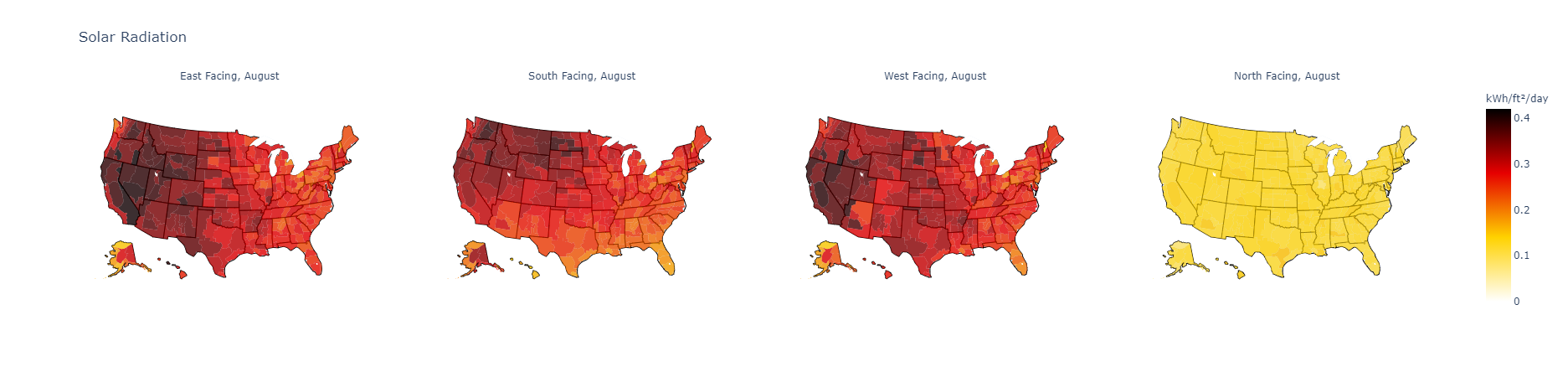
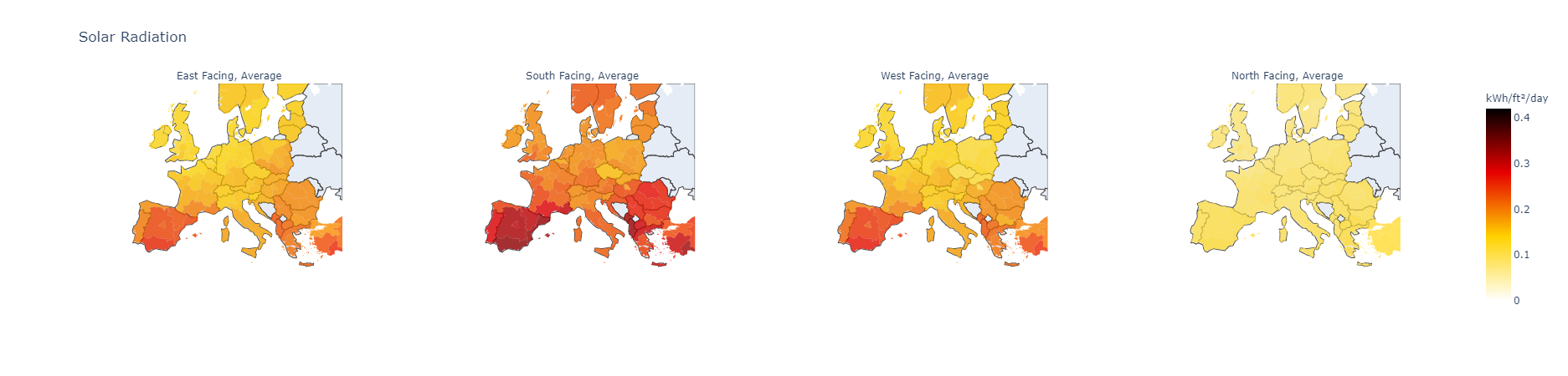
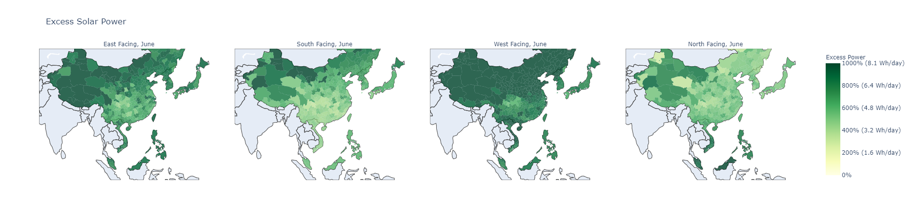
The app allows a variety of user inputs to explore the data and different use cases. In general, the app is looking at smart window features that require some power draw per day (user can customize) and comparing those with the power generated by a solar window (user can customize efficiency values and product area). The maps will display whether or not the smart window features selected can be powered by the solar window in a given location for a given month. The default is to look at the worst case scenario solar radiation for each individual location, because if the features can be powered in the worst case, they can be powered the rest of the year as well. The data can also be viewed for annual average solar irradiation or per individual month as well. The user can view excess power generation by the solar window, beyond what is required for the smart window features, as well as the pure solar radiation data for a horizontal surface facing East, South, West, or North. Data for these selections can be viewed in a few different geographies (USA and sections of Europe, Asia, and Oceania). The graphs are all interactive and clickable so you can see where the data came from for a given region, and see the details of the calculations being performed.
A more detailed write up on the data manipulation and dashboard code can be found on the GitHub README document.